
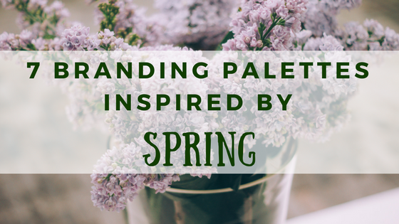
It’s almost time to put your winter clothes back in the closet! We are now entering the land of pastels and pollen! Since Spring has almost sprung, it’s time to give you 7 color palettes inspired by Spring!
What’s the big deal about using the time of year to inspire your color selection? Well for starters, it helps to ensure that you’re seasonally appropriate and aware of any upcoming holidays, HINT: St. Patrick’s Day and Easter are right around the corner.
Artists have been going to nature for inspiration for centuries (just think Monet and his Water Lillies) so it’s time that marketers follow suit!
Check out the below palettes for inspiration!:
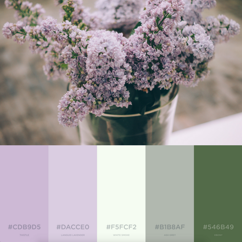
Lilac & Lavender
 I know what you’re thinking…
 Credit: Giphy
But aren’t these colors just so peaceful to look at!? The light shades of purple with the off-white and hunter green remind me of my childhood and happy spring days. These colors can work for a more professional brand or an edgy, creative brand. Good luck trying to pick your favorite color from this bunch!
Pastries in Paris
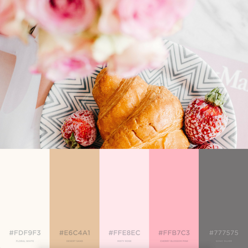
This photo gives me all the Parisian vibes for some reason. Maybe it’s just because we have a serious case of the travel bug but this picture is giving us all the feels. Paris, pastries, pink… what more can you ask for? So if your brand wants a fresh take on a feminine palette, these colors are perfect for you!
Easter-ly Eggs
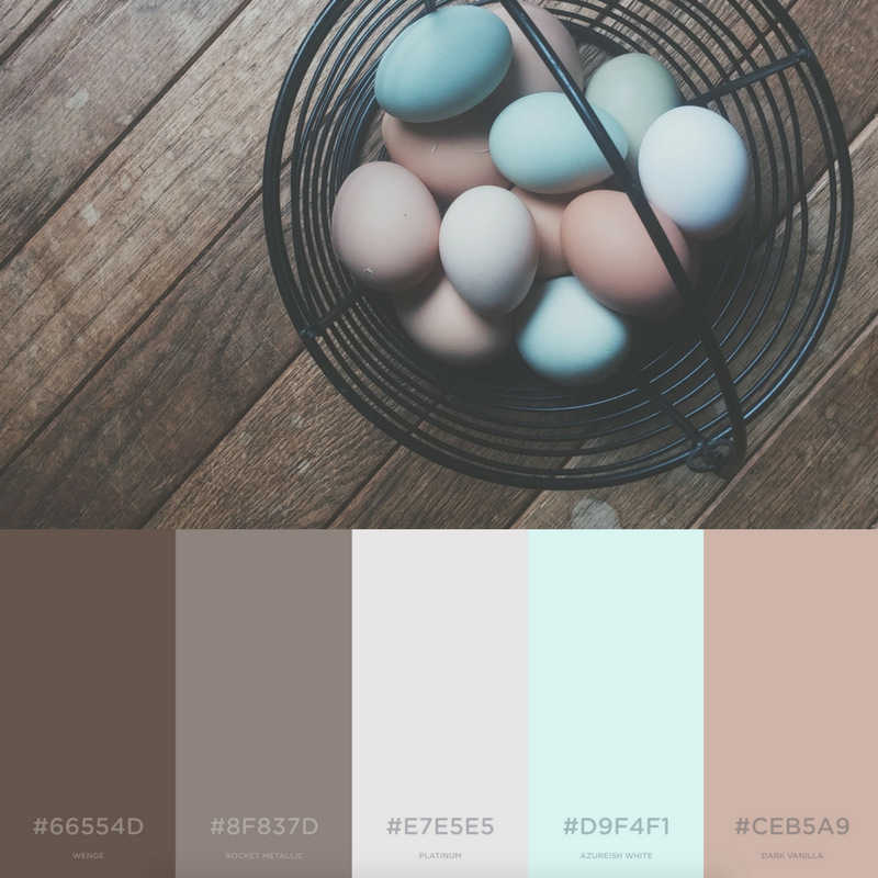
If only we could get our breakfast eggs that we bought in the grocery store to look like this! Although, then they may be just too pretty to eat! This palette brings the color “eggshell” to life in a variety of shades. There’s no other palette we’d like to take a “crack” at more than this one.
Cheery Cherry Blossoms
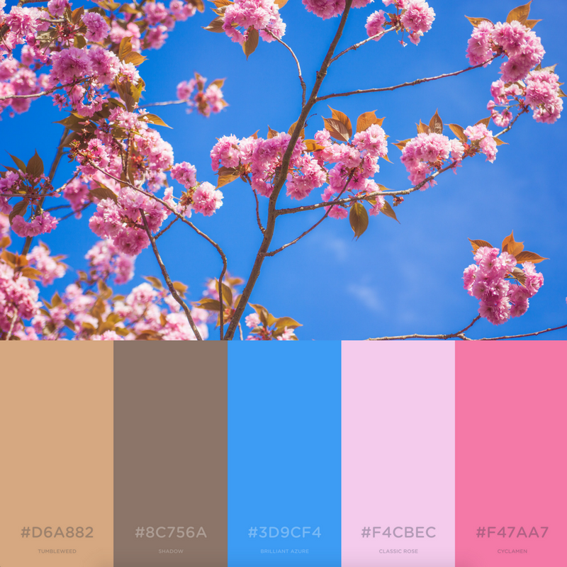
Did you know that the beautiful and iconic cherry blossoms bloom each spring? We would have been remiss not to include these pretty buds in our spring palette. The cherry blossoms paired with the bright blue sky contain everything that is good and right with our world. The warm browns help to anchor the other colors and tie them all together.
Easy, Breezy, Brunch
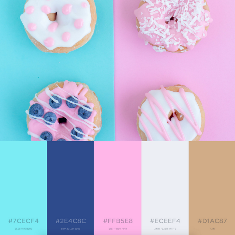
When the weather starts to warm up, it’s time for one of our favorite pastimes: brunch! These donuts give us major spring fever thanks to the fun pastel colors. The only thing more appetizing than these donuts are their colors. With the bright blues and pinks, there’s no better way than to start your day with a donut!
Ringing In Spring

For those of us who looove spring but can’t quite let go of winter, this palette has it all! Most of the colors are bright and fun while the dark blackberry color helps give off some wintery vibes. The unique combo of bright colors with the more muted colors help these options stand out.
Flowery Focus
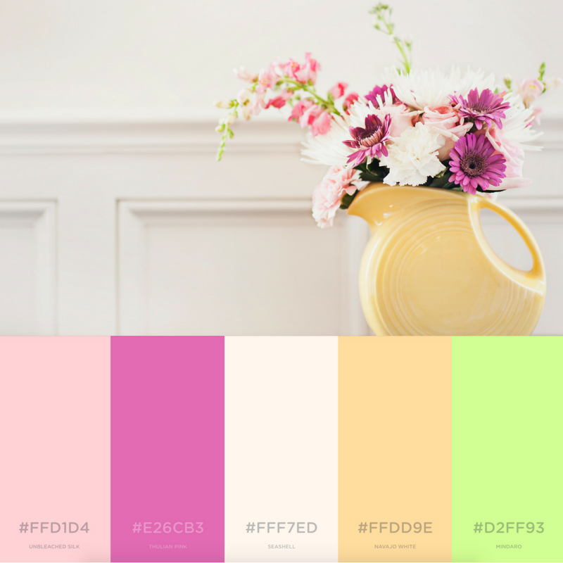
What’s a spring palette without a bright pop of green? This flower pot reminds us that the best is yet to come. The pinks, baby yellows, and festive greens make for memorable brand palette.
So whatever you’re designing, let our palettes help you to create a new palette inspired by one of our favorite seasons! If you have a palette you love, reach out to us! We’d love to spotlight it in our next edition of color palettes!
All photographs are from Unsplash and all color palettes were created with Coolors.
Latest posts by Guest Author (see all)
- How To Own The Holidays - December 21, 2018
- Marketing Analytics 101 - November 28, 2018
- What a Marketer Should Do on Thanksgiving - November 16, 2018